Clarity in Lightroom | Clarity vs Contrast and Clarity Abuse - Lightroom Tutorials #8
In this episode, we'll learn how to properly use the clarity slider in Lightroom and also go in-depth to learn the differences between clarity and contrast. We'll have an understanding of how much clarity is acceptable, how much is not acceptable and how much is total garbage.
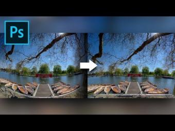
Clarity in Lightroom and also in Photoshop Camera Raw adds texture to the image. It is a form of contrast but very different from it. Clarity slider controls the contrast of just the midtones. When you increase clarity, look at the histogram. You will notice that only the middle of the histogram is affected. On the other hand, when you increase the contrast, all of the histogram is affected from end to end. Hence, increasing or decreasing the clarity slider increases and decreases the contrast of the midtones. Also, when you increase the clarity, zoom in to the highlights or the shadows of the image, they never get affected. Only the tones that are in the middle are affected.
Agreed that clarity enhances the texture of the image and brings out the details, but too much of clarity leads to something, which in the creative world is called "Clarity Abuse". Too much use of clarity slider makes your images sick. If you are a beginner or new to Lightroom, you might be tempted to go overboard with the slider but please don't. Because when you come back later and look at the image, you will find that the image really looks like a piece of garbage. I'm not saying that you shouldn't use the clarity slider. You must, but in moderation. But, here's the catch, the moderation point varies from image to image. Yes, for some images you may require high clarity and for some other you might not require clarity at all. In this video we will look try to discover the moderation point. But then again, it's a personal preference and you will get the hand of it once you start editing your photos. You will find out that as you progress, you will resist from using the clarity slider.
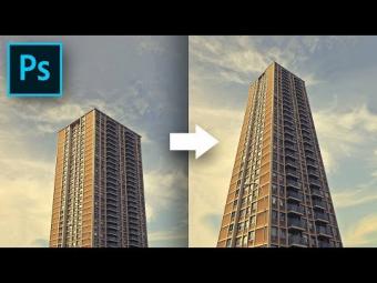
Using too much clarity has a lot of drawbacks. Besides looking unrealistic. If you have a line of contrast, for instance, the line at which a building meets the sky, using too much clarity will create a halo affect around it. In other words, a bright line will form at the line where anything dark meets with anything light. Also, colors and tones will act strange near the lines of contrast.
Is there a way to apply clarity and not have halo effects? Yes! There is! and we will cover that too in this video. One of the ways is to use selective clarity or using adjustment brushes to apply clarity locally. In this method you only apply clarity to the areas that you want to. Not touching the line of contrast, this type of clarity will allow you to get rid of the halo affect and unrealistic tones.
Clarity, just like any other slider in Lightroom, applied in moderation in great, but too much of it makes you image look as if it was on steroids.
Clarity in Lightroom and also in Photoshop Camera Raw adds texture to the image. It is a form of contrast but very different from it. Clarity slider controls the contrast of just the midtones. When you increase clarity, look at the histogram. You will notice that only the middle of the histogram is affected. On the other hand, when you increase the contrast, all of the histogram is affected from end to end. Hence, increasing or decreasing the clarity slider increases and decreases the contrast of the midtones. Also, when you increase the clarity, zoom in to the highlights or the shadows of the image, they never get affected. Only the tones that are in the middle are affected.
Agreed that clarity enhances the texture of the image and brings out the details, but too much of clarity leads to something, which in the creative world is called "Clarity Abuse". Too much use of clarity slider makes your images sick. If you are a beginner or new to Lightroom, you might be tempted to go overboard with the slider but please don't. Because when you come back later and look at the image, you will find that the image really looks like a piece of garbage. I'm not saying that you shouldn't use the clarity slider. You must, but in moderation. But, here's the catch, the moderation point varies from image to image. Yes, for some images you may require high clarity and for some other you might not require clarity at all. In this video we will look try to discover the moderation point. But then again, it's a personal preference and you will get the hand of it once you start editing your photos. You will find out that as you progress, you will resist from using the clarity slider.
Using too much clarity has a lot of drawbacks. Besides looking unrealistic. If you have a line of contrast, for instance, the line at which a building meets the sky, using too much clarity will create a halo affect around it. In other words, a bright line will form at the line where anything dark meets with anything light. Also, colors and tones will act strange near the lines of contrast.
Is there a way to apply clarity and not have halo effects? Yes! There is! and we will cover that too in this video. One of the ways is to use selective clarity or using adjustment brushes to apply clarity locally. In this method you only apply clarity to the areas that you want to. Not touching the line of contrast, this type of clarity will allow you to get rid of the halo affect and unrealistic tones.
Clarity, just like any other slider in Lightroom, applied in moderation in great, but too much of it makes you image look as if it was on steroids.
ÖNERİLEN YAZILAR


YORUMLAR